Back
Banco Familiar
Fintech
Account Redesign
We revamped the Account section to align with the bank’s current digital vision. This involved transitioning from a significantly outdated and outdated interface to a modern, intuitive, and clean design.
The previous design not only had a dated aesthetic but also poor usability. Its dense layout and confusing information architecture often left users feeling lost and uncertain about their finances. This outdated experience eroded user confidence and resulted in a high volume of recurring Customer Support inquiries about finding transaction details, current balances, and managing money. We understood that for such a crucial product, clarity and trust were essential design outcomes.
To achieve this transformation, we implemented several key changes:
- * *A complete visual overhaul introduced a modern design language, maximizing white space and using updated typography for improved scannability and reduced cognitive load.
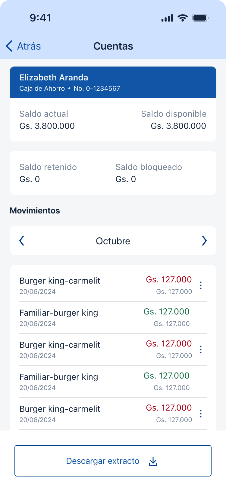
- A simplified Account Dashboard provided a clear hierarchy, making the current balance and recent activity instantly visible.
- Intuitive and accessible navigation components with updated affordances streamlined key actions like viewing statements, transferring funds, or managing account settings.
- Upfront, context-specific information was integrated directly into the section to proactively address questions and reduce the need for external assistance.
- Improved accessibility standards (e.g., color contrast and touch targets) ensured a high-quality experience for all users.
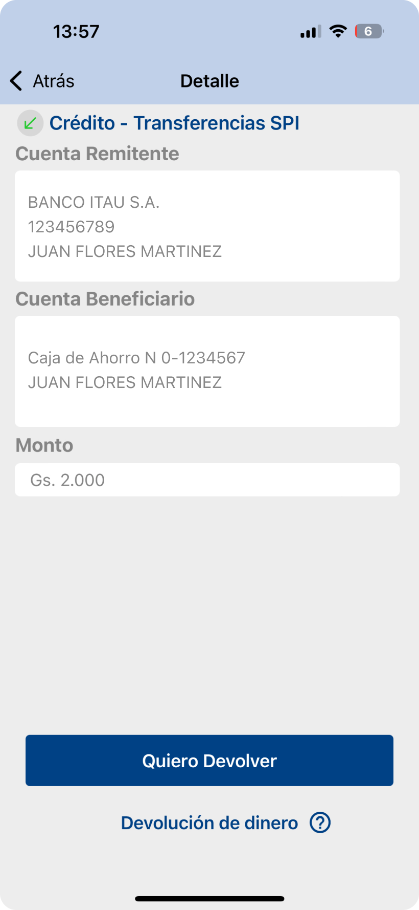
Before

After
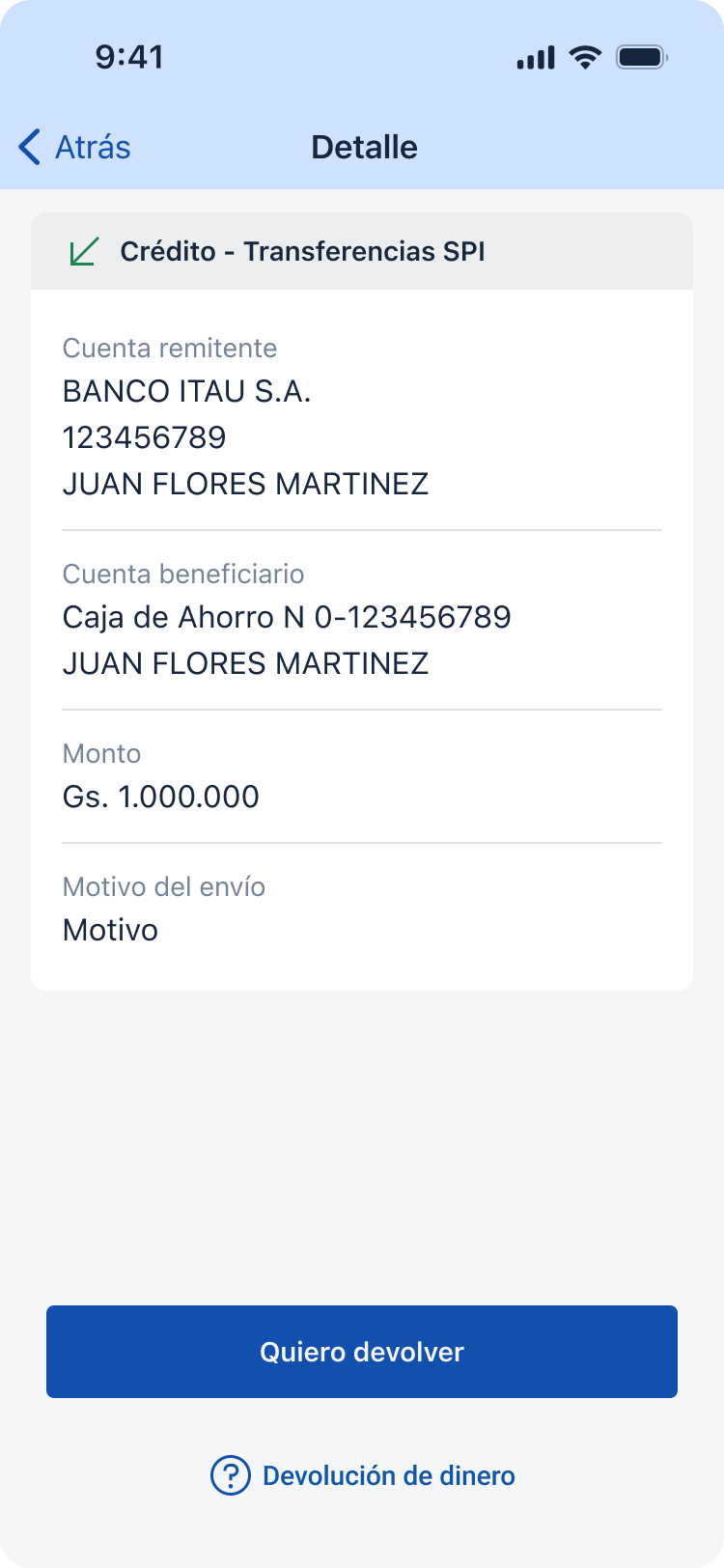
Before
After
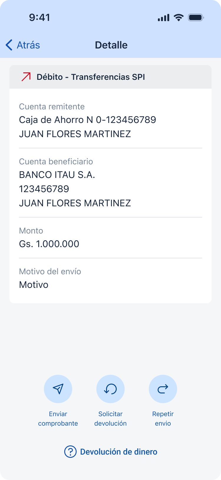
Before

After
Thanks for reading
Want to learn more?
Book a review
Back
Banco Familiar
Fintech
Account Redesign
We revamped the Account section to align with the bank’s current digital vision. This involved transitioning from a significantly outdated and outdated interface to a modern, intuitive, and clean design.
The previous design not only had a dated aesthetic but also poor usability. Its dense layout and confusing information architecture often left users feeling lost and uncertain about their finances. This outdated experience eroded user confidence and resulted in a high volume of recurring Customer Support inquiries about finding transaction details, current balances, and managing money. We understood that for such a crucial product, clarity and trust were essential design outcomes.
To achieve this transformation, we implemented several key changes:
- * *A complete visual overhaul introduced a modern design language, maximizing white space and using updated typography for improved scannability and reduced cognitive load.
- A simplified Account Dashboard provided a clear hierarchy, making the current balance and recent activity instantly visible.
- Intuitive and accessible navigation components with updated affordances streamlined key actions like viewing statements, transferring funds, or managing account settings.
- Upfront, context-specific information was integrated directly into the section to proactively address questions and reduce the need for external assistance.
- Improved accessibility standards (e.g., color contrast and touch targets) ensured a high-quality experience for all users.
Before
After
Before
After
Before
After
Thanks for reading
Want to learn more?
Book a review