Back
Banco Familiar
Fintech
Redesigning the App's Core Navigation (Action Button)
We undertook the redesign of the app's central Action Button and Navigation Hub to align the interface with the bank's current strategic vision, moving from a limited single-purpose feature to a modern, intuitive, and scalable navigation component.
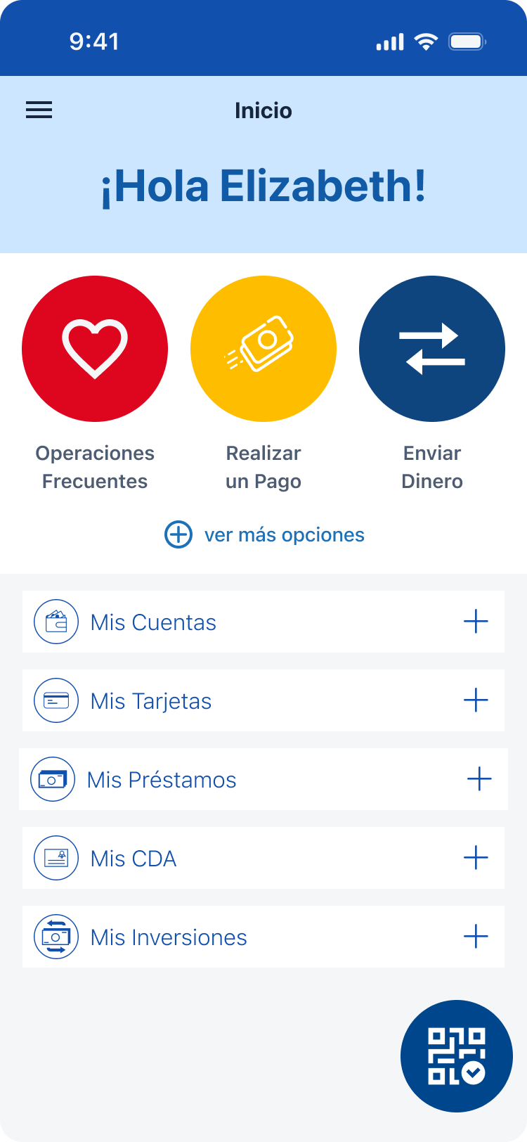
The previous design was restrictive: it was solely dedicated to the QR code action. This limited functionality created friction for users trying to access main app sections or key features quickly, and it offered zero visibility for showcasing new bank products. This single-point focus was a major bottleneck to product discovery and modern app usability. We recognized that to enhance overall app utility and create a channel for business growth, the central action point needed to become a comprehensive navigation hub.
To achieve this transformation, we implemented several key changes:
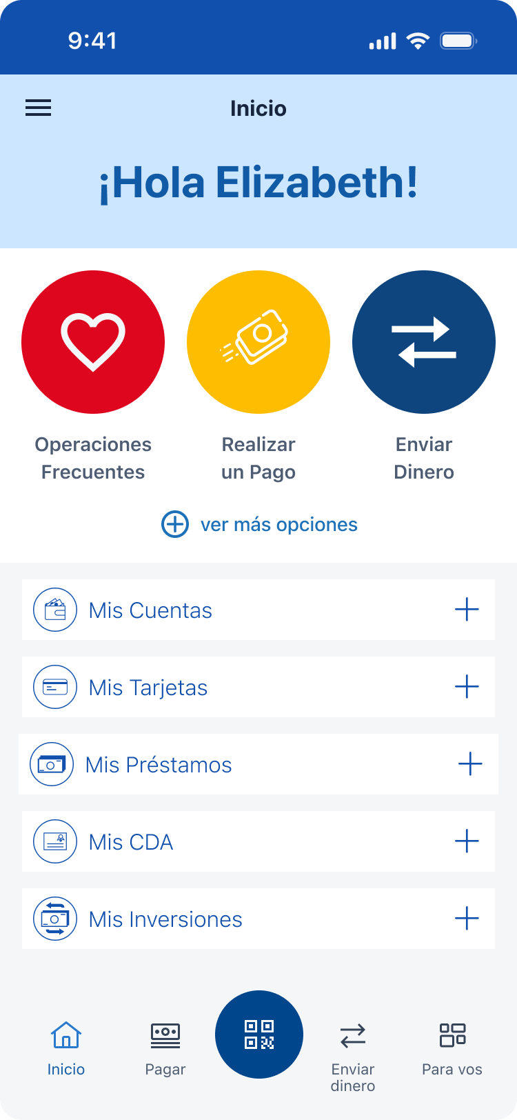
- Expanded Functionality: Transitioned the button from a single QR action to a full navigation component, offering quick access to main sections and principal app actions.
- Intuitive Hierarchy: Designed a new visual system that clearly groups actions, providing an intuitive and accessible navigation structure for users regardless of their task.
- Dedicated Product Discovery Section: Integrated a new section specifically designed to highlight new bank products and promotions, instantly creating a high-visibility channel for business growth within the main app flow.
- Full Visual Overhaul: Introduced a modern design language that maximized clarity and used updated visual affordances, providing users with a cleaner, more reliable sense of location within the app.
- Optimized Usability: Streamlined key action paths, reducing taps required to start a task and making the overall app experience more efficient and user-friendly.
Before
After

Thanks for reading
Want to learn more?
Book a review
Back
Banco Familiar
Fintech
Redesigning the App's Core Navigation (Action Button)
We undertook the redesign of the app's central Action Button and Navigation Hub to align the interface with the bank's current strategic vision, moving from a limited single-purpose feature to a modern, intuitive, and scalable navigation component.
The previous design was restrictive: it was solely dedicated to the QR code action. This limited functionality created friction for users trying to access main app sections or key features quickly, and it offered zero visibility for showcasing new bank products. This single-point focus was a major bottleneck to product discovery and modern app usability. We recognized that to enhance overall app utility and create a channel for business growth, the central action point needed to become a comprehensive navigation hub.
To achieve this transformation, we implemented several key changes:
- Expanded Functionality: Transitioned the button from a single QR action to a full navigation component, offering quick access to main sections and principal app actions.
- Intuitive Hierarchy: Designed a new visual system that clearly groups actions, providing an intuitive and accessible navigation structure for users regardless of their task.
- Dedicated Product Discovery Section: Integrated a new section specifically designed to highlight new bank products and promotions, instantly creating a high-visibility channel for business growth within the main app flow.
- Full Visual Overhaul: Introduced a modern design language that maximized clarity and used updated visual affordances, providing users with a cleaner, more reliable sense of location within the app.
- Optimized Usability: Streamlined key action paths, reducing taps required to start a task and making the overall app experience more efficient and user-friendly.
Before
After
Thanks for reading
Want to learn more?
Book a review