Back
Fintech
Flexible Credit Line
Book a review
Read more
+300K
Impacted Users
over 37%
revolving credit used on first week
3 month
Timeline
Project Overview
Background
Banco Familiar sought to modernize and digitize its existing internal loan offerings. The focus was a specialized revolving credit line product, which offers maximum user flexibility:
- Revolving Feature: Customers can repay any portion of the utilized amount and reuse the funds immediately.
- Term Loan Option: The full line can be utilized at once and repaid over a fixed term.
This product was traditionally managed offline (via branch or phone). Digitizing it was critical to meet modern customer expectations, increase product utilization, and reduce operational costs associated with manual servicing.
Challenge
Implement an offline, complex financial product (the revolving credit line) into the existing Banco Familiar mobile app while overcoming two major constraints:
- Technical Constraint: Integrate the new, flexible product logic into the current, outdated dashboard and app structure without requiring a costly and time-consuming rework of the entire banking application.
- UX Constraint: Design a digital experience that is modern, appealing, and easy to understand for the customer, clearly communicating the unique features of a revolving line (utilization, repayment, reuse) within a visually dated environment.
Objectives
Digitize the Product: Successfully launch the revolving credit line within the mobile app, making it instantly accessible and operational 24/7.
Increase Product Utilization: Drive higher utilization of the credit line by providing a clear, appealing, and self-service digital interface.
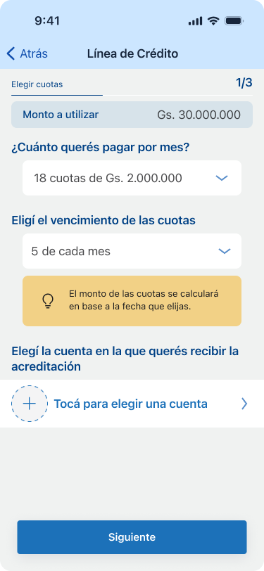
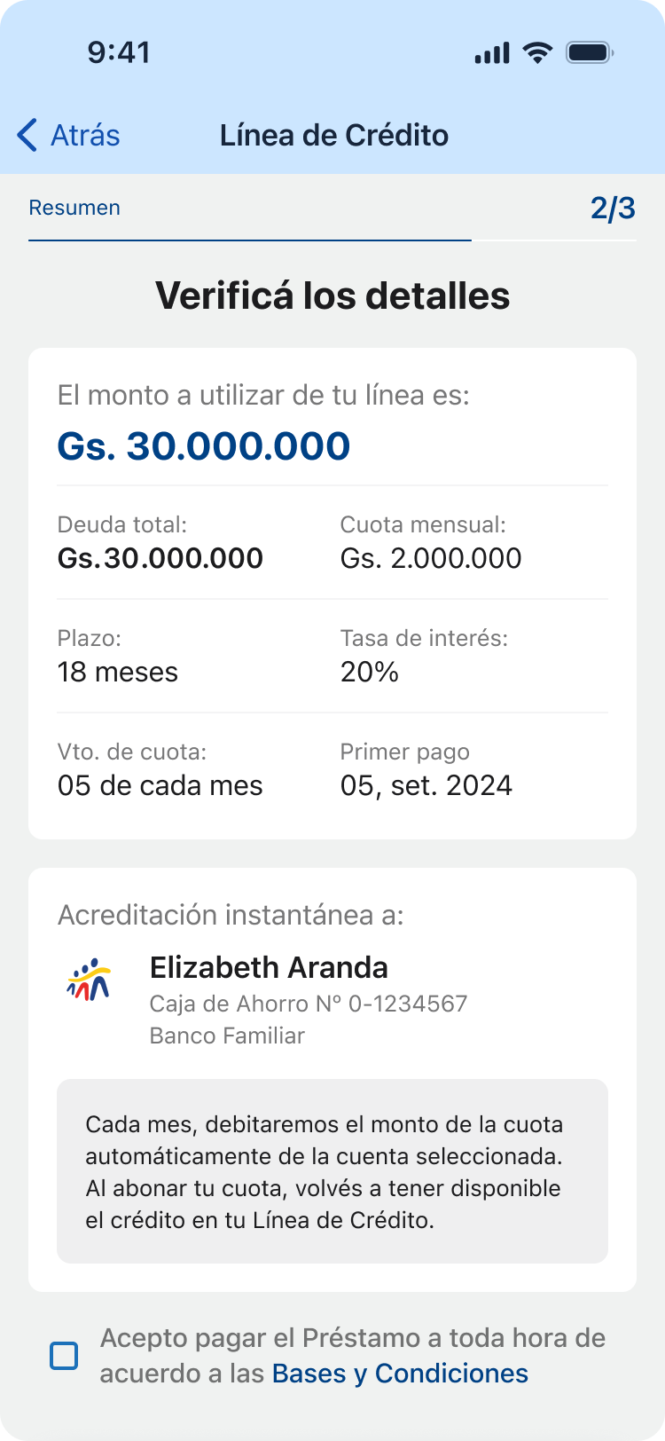
Simplify Complex Logic: Translate the complex "repay and reuse" revolving mechanism into a simple, intuitive dashboard experience that minimizes customer confusion.
Modernize UX within Constraints: Deliver a modern and usable experience that minimizes friction and elevates the app's overall feel, despite being applied to an older dashboard framework.
Team
1 Product Owner
1 UX/UI Designers
4 Backend Developers
2 Mobile Developers
2 QA Analysis
My role
Sr. UX/UI Designer
End-to-end UX/UI design
User-testing
Timeline
3 months
Fintech
About the bank
Banco Familiar S.A.E.C.A. is a key player in Paraguay's financial development, evolving from its founding in 1967 as Crédito Familiar to a full-service bank in 2009.
The bank's mission is to be the preferred bank for individuals and SMEs by offering comprehensive financial solutions (savings, credit, and services) that build long-term relationships of trust and drive mutual growth. It focuses on efficiency, honesty, and transparency to support personal and business projects across the country.

Context
Starting point
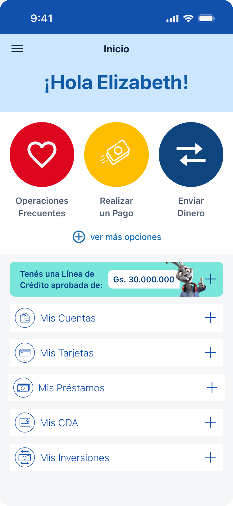
Offline Product, No Self-Service
The revolving credit line was entirely an offline product. Customers had to call or visit a branch for utilization, repayment, and balance checks, creating a massive barrier to adoption and generating high manual operation costs for the bank.
Complex Logic, Poor Communication
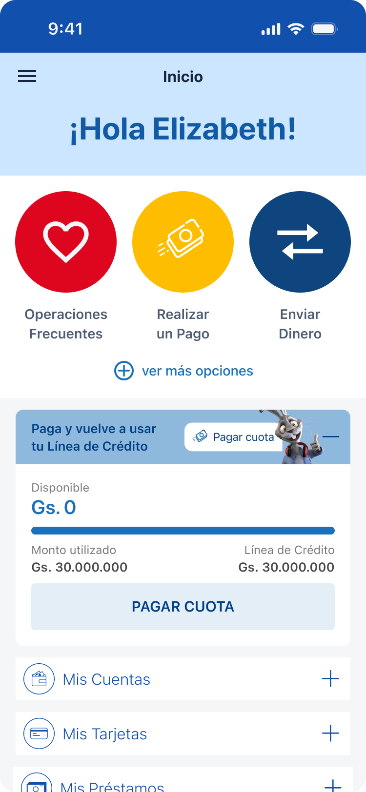
The revolving credit logic was complex and difficult to manage offline. Customers lacked a clear mental model of their available credit and utilization, resulting in low product utilization.
Integration into Outdated UX
The outdated dashboard structure created a Scalability & Modernity Roadblock. Its rigid architecture forced the new product into an old design, preventing the application of modern UX patterns.
Existing screens
Initial premise
Objective
User’s perspective
Ease the understanding of the product & deliver delight
Business
To drive higher user engagement and transactions
Tech
Seamlessly incorporate complex animations
Process
Our strategy for digitizing the revolving credit line was defined by close collaboration and rapid, validated learning.
Deep Discovery & Problem Validation
The process began with a deep discovery phase combining internal data analysis and user research. Our goal was to understand the high-friction, low-utilization problems stemming from the product's offline nature.
This initial work validated the key issues: the massive self-service barrier created by the product being offline, the lack of a clear mental model for the complex revolving logic, and the rigid architectural constraints of the old dashboard.
Cross-Functional Design & Iteration
To ensure seamless integration and business alignment, we immediately initiated rapid design and iteration cycles, working very closely with all stakeholders and developers. This included:
- Design Sprints: We held cross-functional workshops with Engineering and Business teams to quickly validate solutions and ensure technical feasibility against the "no backend refactoring" constraint.
- Rapid Prototyping: Solutions were designed and tested iteratively, ensuring the new product module was both modern and functional within the outdated app environment.
User-Driven Strategy & Brand Integration
Crucially, user interviews were conducted throughout the process. These sessions highlighted the need for a friendly, approachable voice to demystify the complex financial product.
Based on this insight, a key outcome of the process was the strategic proposal to use the Banco Familiar mascots directly within the app's new design to promote the credit line and guide users, making the product feel more approachable and appealing.
Product features
Deliverables
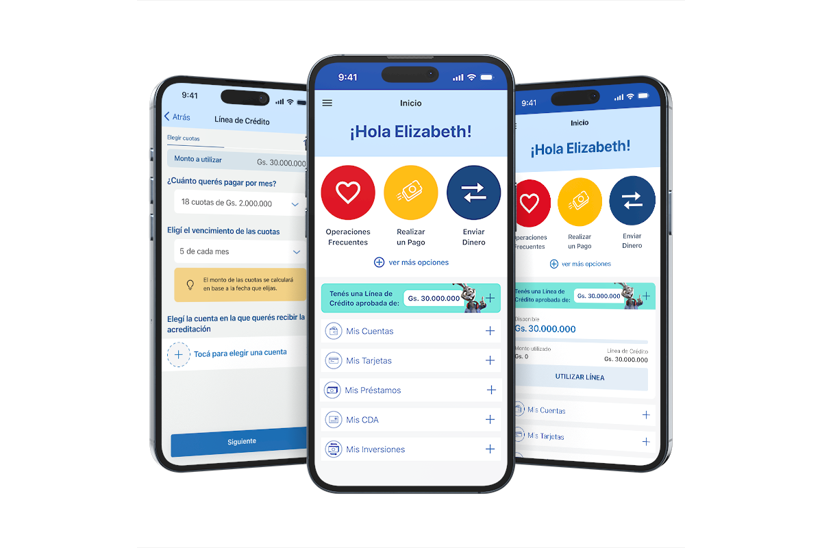
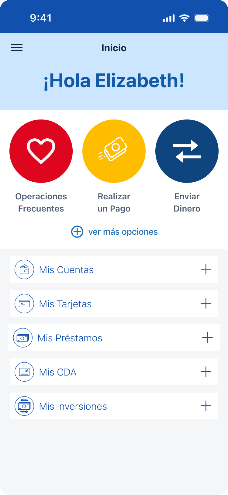
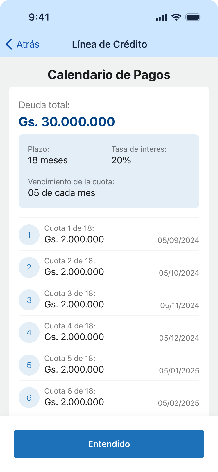
Revolving Credit
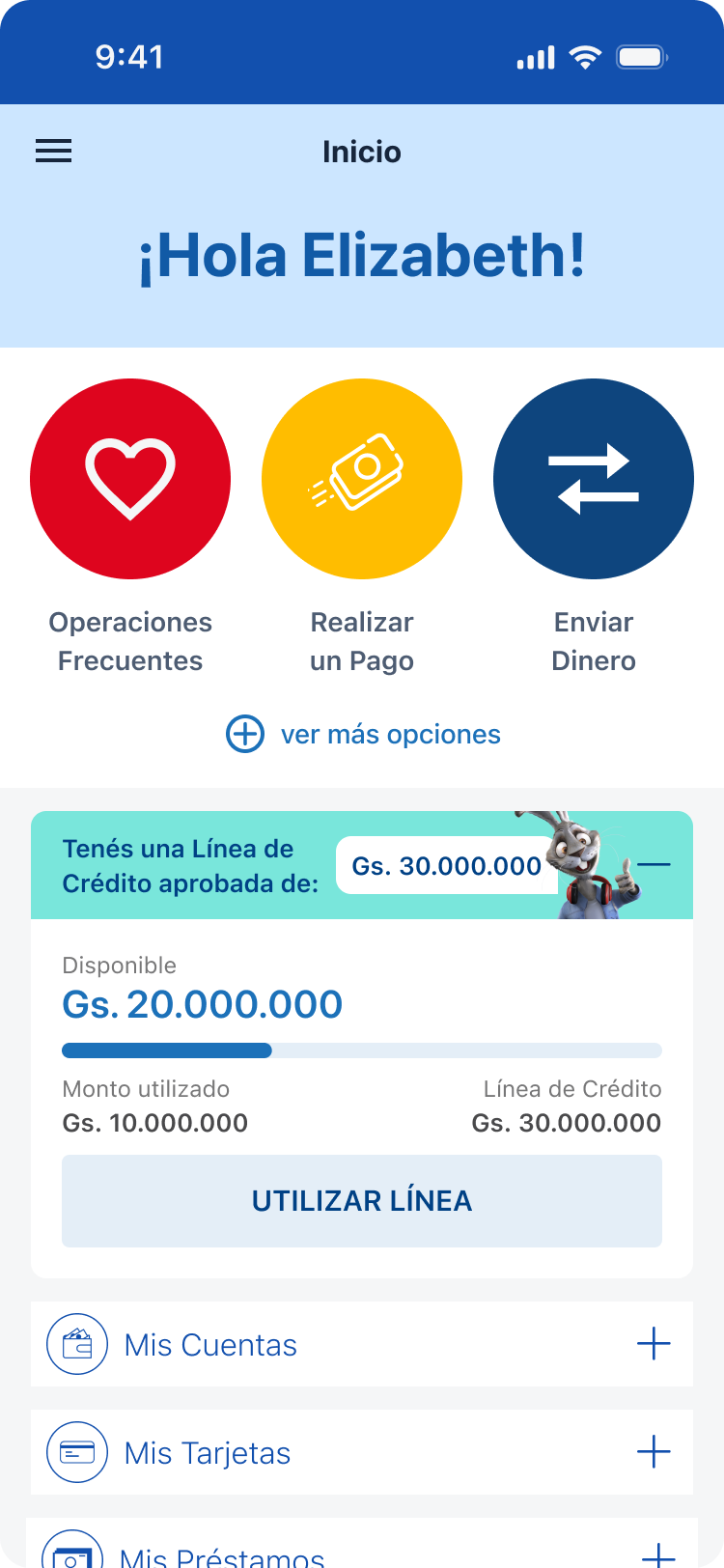
Feature
New Offer
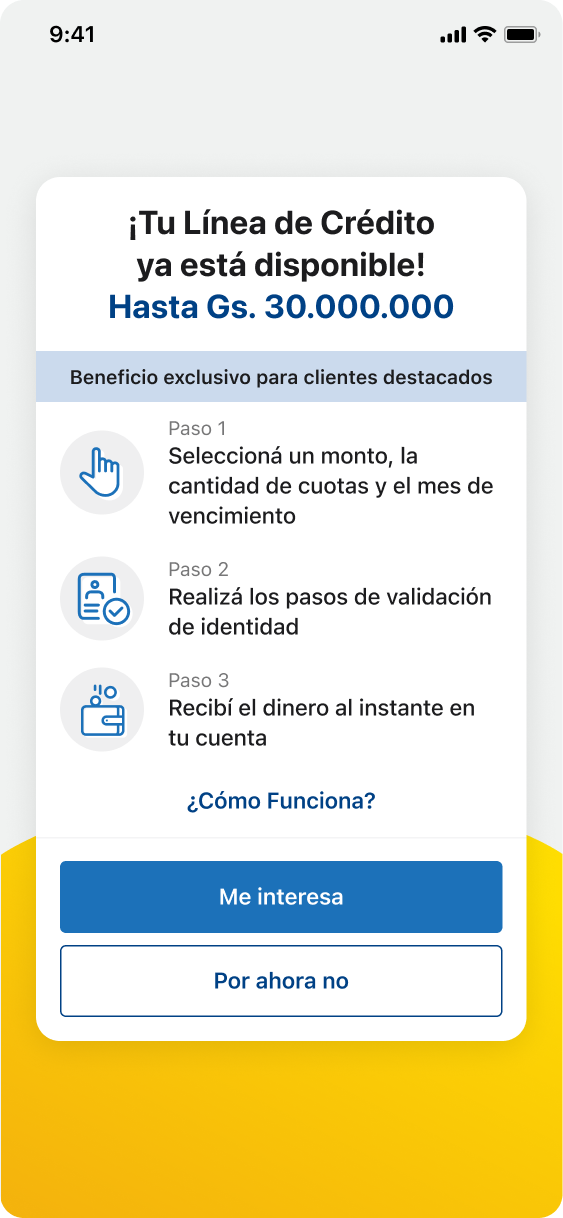
Feature
Credit in use
Feature
Other screens
Thanks for reading
Want to learn more?
Book a review
Back
Fintech
Flexible Credit Line
Book a review
Read more
+300K
Impacted Users
over 37%
revolving credit used on first week
3 month
Timeline
Project Overview
Background
Banco Familiar sought to modernize and digitize its existing internal loan offerings. The focus was a specialized revolving credit line product, which offers maximum user flexibility:
- Revolving Feature: Customers can repay any portion of the utilized amount and reuse the funds immediately.
- Term Loan Option: The full line can be utilized at once and repaid over a fixed term.
This product was traditionally managed offline (via branch or phone). Digitizing it was critical to meet modern customer expectations, increase product utilization, and reduce operational costs associated with manual servicing.
Challenge
Implement an offline, complex financial product (the revolving credit line) into the existing Banco Familiar mobile app while overcoming two major constraints:
- Technical Constraint: Integrate the new, flexible product logic into the current, outdated dashboard and app structure without requiring a costly and time-consuming rework of the entire banking application.
- UX Constraint: Design a digital experience that is modern, appealing, and easy to understand for the customer, clearly communicating the unique features of a revolving line (utilization, repayment, reuse) within a visually dated environment.
Objectives
Digitize the Product: Successfully launch the revolving credit line within the mobile app, making it instantly accessible and operational 24/7.
Increase Product Utilization: Drive higher utilization of the credit line by providing a clear, appealing, and self-service digital interface.
Simplify Complex Logic: Translate the complex "repay and reuse" revolving mechanism into a simple, intuitive dashboard experience that minimizes customer confusion.
Modernize UX within Constraints: Deliver a modern and usable experience that minimizes friction and elevates the app's overall feel, despite being applied to an older dashboard framework.
Team
1 Product Owner
1 UX/UI Designers
4 Backend Developers
2 Mobile Developers
2 QA Analysis
My role
Sr. UX/UI Designer
End-to-end UX/UI design
User-testing
Timeline
3 months
Fintech
About the bank
Banco Familiar S.A.E.C.A. is a key player in Paraguay's financial development, evolving from its founding in 1967 as Crédito Familiar to a full-service bank in 2009.
The bank's mission is to be the preferred bank for individuals and SMEs by offering comprehensive financial solutions (savings, credit, and services) that build long-term relationships of trust and drive mutual growth. It focuses on efficiency, honesty, and transparency to support personal and business projects across the country.
Context
Starting point
Offline Product, No Self-Service
The revolving credit line was entirely an offline product. Customers had to call or visit a branch for utilization, repayment, and balance checks, creating a massive barrier to adoption and generating high manual operation costs for the bank.
Complex Logic, Poor Communication
The revolving credit logic was complex and difficult to manage offline. Customers lacked a clear mental model of their available credit and utilization, resulting in low product utilization.
Integration into Outdated UX
The outdated dashboard structure created a Scalability & Modernity Roadblock. Its rigid architecture forced the new product into an old design, preventing the application of modern UX patterns.
Existing screens
Initial premise
Objective
User’s perspective
Ease the understanding of the product & deliver delight
Business
To drive higher user engagement and transactions
Tech
Seamlessly incorporate complex animations
Process
Our strategy for digitizing the revolving credit line was defined by close collaboration and rapid, validated learning.
Deep Discovery & Problem Validation
The process began with a deep discovery phase combining internal data analysis and user research. Our goal was to understand the high-friction, low-utilization problems stemming from the product's offline nature.
This initial work validated the key issues: the massive self-service barrier created by the product being offline, the lack of a clear mental model for the complex revolving logic, and the rigid architectural constraints of the old dashboard.
Cross-Functional Design & Iteration
To ensure seamless integration and business alignment, we immediately initiated rapid design and iteration cycles, working very closely with all stakeholders and developers. This included:
- Design Sprints: We held cross-functional workshops with Engineering and Business teams to quickly validate solutions and ensure technical feasibility against the "no backend refactoring" constraint.
- Rapid Prototyping: Solutions were designed and tested iteratively, ensuring the new product module was both modern and functional within the outdated app environment.
User-Driven Strategy & Brand Integration
Crucially, user interviews were conducted throughout the process. These sessions highlighted the need for a friendly, approachable voice to demystify the complex financial product.
Based on this insight, a key outcome of the process was the strategic proposal to use the Banco Familiar mascots directly within the app's new design to promote the credit line and guide users, making the product feel more approachable and appealing.
Product features
Deliverables
Revolving Credit
Feature
New Offer
Feature
Credit in use
Feature
Other screens
Thanks for reading
Want to learn more?
Book a review