Back
EKO Wallet
Fintech
EKO Design System: Unifying Vision with Technical Foundation
We successfully created and implemented a comprehensive Design System within Figma for the EKO Wallet application, fundamentally aligning the product's visual and technical foundation with the current digital vision. This initiative involved establishing a robust, scalable system that transitions the app from disparate, manually managed styles to a unified, token-driven component architecture.
The previous lack of a cohesive design system led to significant inefficiencies for the entire product team. Designers and engineers struggled with style inconsistencies, redundant component creation, and slow feature development. Implementing Light and Dark Modes would have been impossible without a foundational system. This fragmented approach resulted in a brittle codebase and an inconsistent user experience. We understood that for a growing digital product, scalability, consistency, and efficiency were essential design outcomes.
To achieve this transformation and future-proof the product, I implemented several key technical and structural changes:
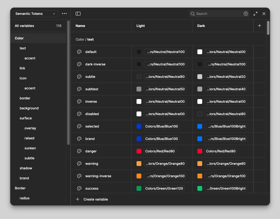
- Design Token Architecture: I meticulously defined and implemented a complete set of Design Tokens (e.g., color, typography, spacing, radius). This created the essential layer of abstraction, linking design decisions to code for ultimate flexibility and a single source of truth.
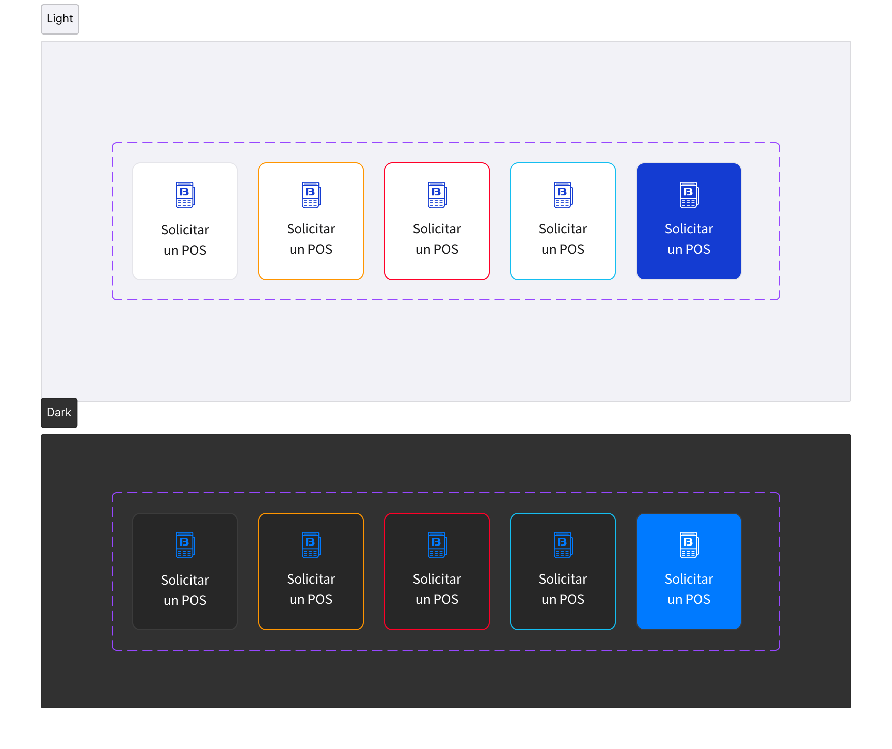
- System Refactoring for Theme Support: I systematically refactored all core Figma components to leverage the newly created tokens, ensuring that components could seamlessly switch between the Light and Dark Mode themes via token mapping (e.g., $color-primary-default mapping to different hex codes per theme).
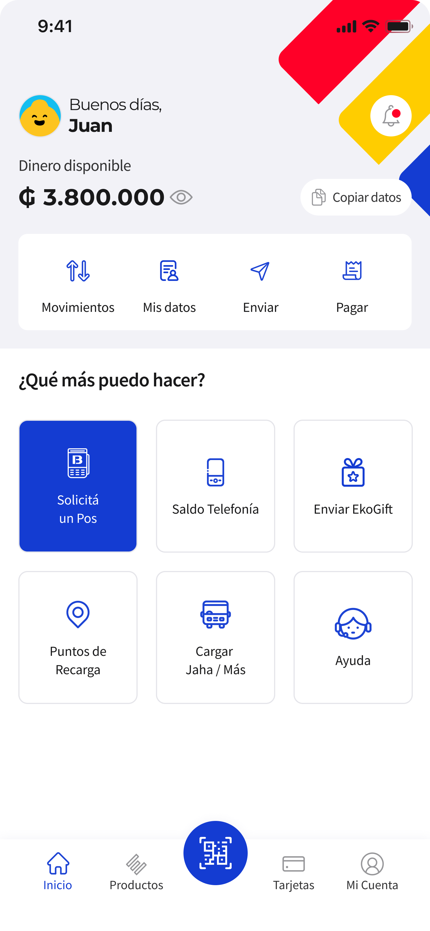
- Component Modularity and Consistency: I rebuilt components to maximize reusability and adherence to modern UI/UX patterns, which reduced the overall number of components while increasing their flexibility.
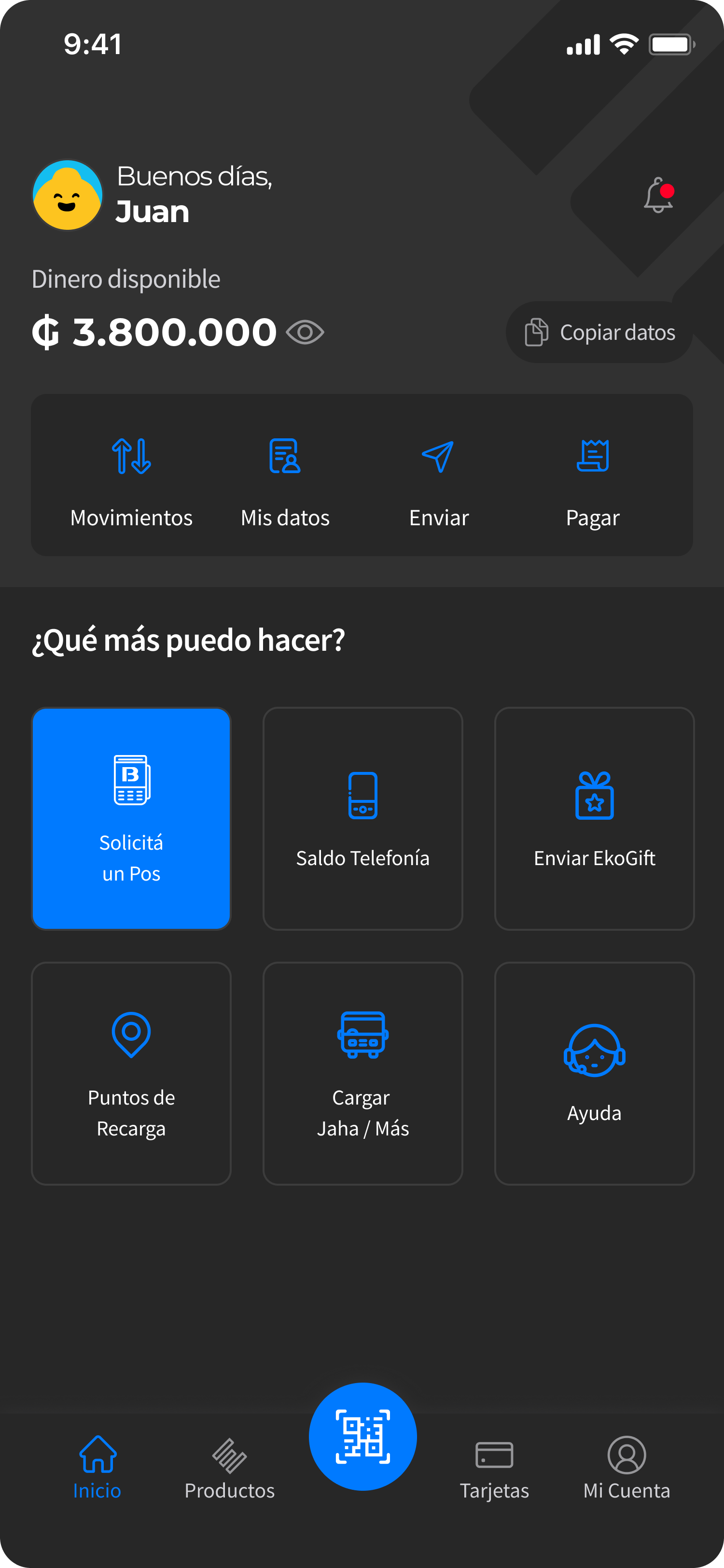
- Accessibility and User Preference: The token architecture directly supported a robust Dark Mode implementation, providing a high-quality, comfortable experience for users who prefer reduced screen glare, particularly in low-light environments.
- Improved Collaboration and Efficiency: Establishing this system drastically improved the hand-off process with engineering, leading to faster development cycles, reduced technical debt, and freeing up design time to focus on innovation.
Thanks for reading
Want to learn more?
Book a review
Back
EKO Wallet
Fintech
EKO Design System: Unifying Vision with Technical Foundation
We successfully created and implemented a comprehensive Design System within Figma for the EKO Wallet application, fundamentally aligning the product's visual and technical foundation with the current digital vision. This initiative involved establishing a robust, scalable system that transitions the app from disparate, manually managed styles to a unified, token-driven component architecture.
The previous lack of a cohesive design system led to significant inefficiencies for the entire product team. Designers and engineers struggled with style inconsistencies, redundant component creation, and slow feature development. Implementing Light and Dark Modes would have been impossible without a foundational system. This fragmented approach resulted in a brittle codebase and an inconsistent user experience. We understood that for a growing digital product, scalability, consistency, and efficiency were essential design outcomes.
To achieve this transformation and future-proof the product, I implemented several key technical and structural changes:
- Design Token Architecture: I meticulously defined and implemented a complete set of Design Tokens (e.g., color, typography, spacing, radius). This created the essential layer of abstraction, linking design decisions to code for ultimate flexibility and a single source of truth.
- System Refactoring for Theme Support: I systematically refactored all core Figma components to leverage the newly created tokens, ensuring that components could seamlessly switch between the Light and Dark Mode themes via token mapping (e.g., $color-primary-default mapping to different hex codes per theme).
- Component Modularity and Consistency: I rebuilt components to maximize reusability and adherence to modern UI/UX patterns, which reduced the overall number of components while increasing their flexibility.
- Accessibility and User Preference: The token architecture directly supported a robust Dark Mode implementation, providing a high-quality, comfortable experience for users who prefer reduced screen glare, particularly in low-light environments.
- Improved Collaboration and Efficiency: Establishing this system drastically improved the hand-off process with engineering, leading to faster development cycles, reduced technical debt, and freeing up design time to focus on innovation.
Thanks for reading
Want to learn more?
Book a review